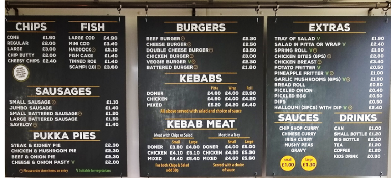
Of all the marketing decisions that fast food restaurants face, the design of the menu is not often thought to be the most important. Yet, the constraints on the design of a menu are numerous and often pull in opposite directions. So, getting it right can be an enormous challenge.

When a menu contains too much information, it puts a significant strain on decision making.
- display the range of meals on offer, including starters, mains, side dishes, desserts, and drinks,
- arrange items in categories (e.g., meat versus fish dishes, vegetarian options, kids deals, etc),
- display the name of the item and a short description,
- display quantity and price,
- display dietary information, such as the number of calories, relevant to specific allergies, and so on.
- It also needs to be clear enough to direct attention to ‘favourites’ or a ‘meal-of-the-day’, to be easy to read, such that one can find something at-a-glance, to convey the brand values, and after all this is needs to be visually pleasing.
It is important to balance the visual aspects of the menu – keeping it visually appealing while at the same time display sufficient information to meet the needs of different customers. The danger is in creating something that looks like a beautiful work of art but which conveys too little, or, on the other hand, presenting something that looks like an unappealing Excel spreadsheet.
Using IMPRESS to evaluate a chain restaurant’s menu design
We were recently commissioned by a fast food company in the US to evaluate several menu designs that could meet this challenge. This is a fast food chain that is especially popular during lunchtimes and among local office workers, where most purchases are takeaways. According to the brief, one of the key problems was the build-up of a queue backlog during peak times. This was not necessarily due to shortage of staff or slowness of the delivery process, but more often caused by the amount of time it took customers to choose their meal. So the solution was to design a new menu board that would cover all of the needs described above, but at the same time help customers in the queue make quicker decisions. The creative team produced six main design themes, based firstly on aesthetics and then on the information conveyed through different kinds of layouts.
To evaluate the visual appeal of the designs we applied our IMPRESS platform, which was designed to deploy and analyse implicit reaction time tests rapidly. This test is used to provide a profile of a design based on a range of attributes, and in this case 30 relevant attributes. By careful selection of attributes it is possible to identify the strengths and weaknesses of a design (and how well each delivers the brand’s values) without directly asking respondents.
As has been well documented elsewhere, traditional methods of gathering consumer evaluations over-rely on subjective views and there are several problems with this.
Firstly, respondents may only be consciously aware of global and generalised feelings, but not more specific feelings. It has been argued that self-knowledge is often based on trying to rationalise one’s own behaviour, rather than by having a ‘privileged access’ into one’s deeper feelings. Attitudes and feelings can hence be very difficult to identify and put into words.
Secondly, respondents may try to appear consistent in their responses. This results in poor discrimination as they assign all of their positive evaluations to the brand they prefer the most and all of the negative evaluations to the brand they prefer the least. Yet in reality, consumers often feel ambivalent towards brands and without a detailed, more discriminative response, a brand will never know its genuine strengths and weaknesses.
A third problem with relying on subjective methods is that respondents may deliberately try to hide their feelings. This can happen when one is asking about certain behaviours that might be embarrassing, illegal, or socially less acceptable, or even if respondents want to hide their feelings for no obvious reason other than they just do not want to divulge the information.
Done properly, implicit reaction time tests abstract how a respondent feels about the design, brand, and packaging and so on without directly asking them. By presenting words and images on the screen very rapidly and requiring a quick response, it is possible to infer how they feel towards the brand. For this project, we employed our implicit test on each design and on regular customers, lapsed customers, and considerers.
The question concerning how menu information can be presented to maximise customer decisions required us to consider a range of candidate tests. One of the advantages of employing a team of experienced psychologists and neuroscientists is that they have familiarity with a range of cognitive tests, and so they are not restricted to the set of tools most often used in neuromarketing but open to scores of tests used in academia but which can have direct use in consumer research. For this, we identified a scientifically validated test of working memory.
The logic for using this test is this:
Imagine that you have entered a restaurant you have never visited before. You are in the queue, unsure what you want, but your turn to order is rapidly approaching. You look at the menu board. There are so many options…you’re studying the menu board but it looks too much like an Excel spreadsheet. You consider one option and all it has to offer (a brief description, the quantity, its price, the number of calories), and then a second, but by the time you have considered option two, you have forgotten the first. You commit to an option, it might not be your ideal, but at least you got through the ordeal.

From a psychological viewpoint, we would argue that a poorly organised menu board will put a strain on working memory. This aspect of memory deals with immediate information that needs to be stored over the short-term (Baddeley, 1986; Cowan, 2014). Examples, would be a shopping list held in memory, or a list of drinks ordered for you and your friends you store mentally as you wait to be served at a bar. Working memory has a fixed capacity and people differ in their working memory capacity – some people can easily recall a dozen or so items in the short term, while others have problems with more than three or so. The way information is presented can also impose limits working memory. Menu boards can differ in how well they support working memory. A poorly designed memory board places severe constraints on one’s working memory capacity, leading to problems in making a decision. A well organised menu board can make use of a person’s optimal working memory capacity. While there are some general rules about how to optimise working memory, not all of these are relevant to menu board design. So the method here was to test six layouts to identify the limits of working memory capacity for each design.
Menu boards consisted of four main sections. Each section was re-created using two different designs. This means that the total number of configurations was sixteen, meaning that one could create sixteen unique menu boards from these designs. However, for the client, several of these were ruled out due certain considerations (i.e., a mix of aesthetics and functionality). Hence we tested eight configurations implicitly and in terms of their effects on working memory. After an initial pilot phase, a further two configurations were ruled out and we subsequently tested four configurations in the implicit and working memory tests.
The sample was drawn from brand-aware respondents in the US, split into regular users, occasional users and light users. They evaluated each design on 30 attributes that covered the features and benefit of the brand, in an implicit test. We were then able to provide profiles of each menu design which quantifies the strengths and weaknesses of each.
In the next phase respondents took the working memory test which was similar to the change blindness method. Images were presented in quick succession and respondents had to press one of two keys, depending upon whether they thought the image was the same or different. A correct response occurs when the respondent detect a change or correctly detects no change and indicates good working memory. An incorrect response means the change was either missed or thought to be present when it wasn’t (false alarm) and indicates poor working memory.
Results
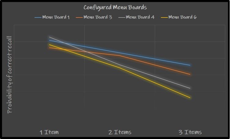
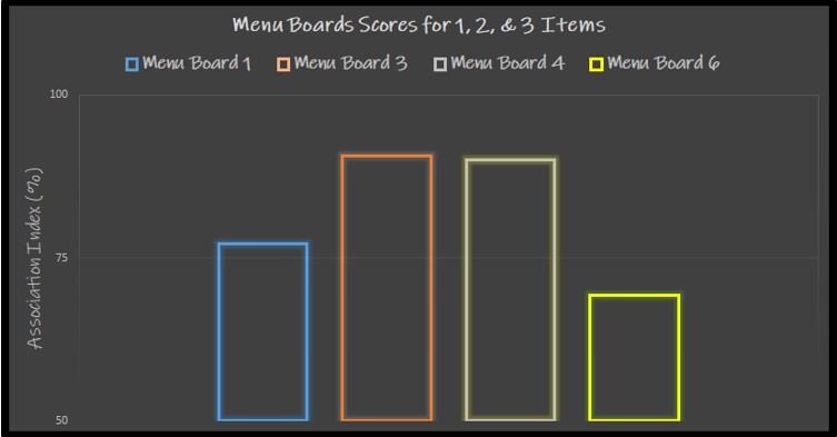
For each menu element, we computed the probability of correct recall, hence in our data we had recall scores for 1, 2, and 3 items for each menu design, as well as an overall recall score for each design. Results for all sample (weighted), see below. The data shows that even when there is only one item, responses are not 100% correct, reflecting the difficulty of memorising menu items in the short term. This ability declines when there are two items, and falls even further with three items. In fact, for Menu Boards 4 and 6, recall is less than 50% with three items. Menu Boards 1 and 3 were significantly better in aiding working memory. Looking at the implicit data, Menu Board 6 was very clearly least able to deliver the brand values, whereas as Menu Boards 3 and 4 strongly delivered brand values around health and customer service, as well as purchase intent and advocacy, with menu Board 1 lagging behind these two.

Results of the working memory test. Probability of correct recall for each menu board containing 1, 2 or 3 menu items.

Results of the implicit test. Implicit association scores computed as an Association Index (%).
An important insight here is that a menu board design that visually delivers brand values may not be the best in terms of being easy to use at a functional level. If one wishes to prefer the design that is most congruent with the brand values then one could choose Menu Board 3 or 4. However, Menu Board 1 clearly works better at optimising working memory. Menu Board 3 may be the preferred option since it balances both constraints.
Further analysis revealed differences in both tests between males and females, between customers with varying frequency of visit, and between different age groups. For example, and as expected, the older group performed worse on the working memory test and the youngest group performed the best. It was interesting to note that high frequency visitors performed less well on the working memory test than did low frequency visitors, which is surprising given their greater familiarity (presumably) with the menu items. However, this may even be a symptom of the difficulties the company were having with the previous design, meaning that due to the difficulties in choosing from the menu, high frequency customers may habitually buy the same option. The more optimal design may therefore encourage their loyal customers to explore the range of options being offered.
Armed with this information, the company then chose the top design in the knowledge that it can drive the brand image whilst at the same time working as a functional, easier to use menu board. In addition, the company used the data gathered to optimise the design further by using learnings regarding individual components of the full set of designs.

The study shows what can be achieved by using a combination of objective psychological tests. Rather than simply invite consumers to state their preferences, these methods allow us to dig deeper and find a more optimal solution. The research shows that the many constraints put on menu design need to be researched objectively if the menu is to deliver its purpose effectively.
Of course, working memory is involved in many consumer activities, not just studying a menu. It is at work on the shelf in the supermarket, in fact in any shopper situation where comparisons of goods or offers are being made. Working memory is the hub through which all sensory stimuli are processed and integrated (consciously and unconsciously) with knowledge, beliefs, and intuitions. Its role in consumer psychology has only very recently been a subject of academic research (e.g., Sanchez & Alley, 2010). For brands, researching how their products are stored in working memory and how accessible they are, is crucial for a deeper understanding of the decisions made at various touchpoints, especially the intention to make a purchase.
References:
Baddeley AD. Working memory. Oxford: Clarendon Press; 1986. Oxford Psychology Series #11.
Cowan N. Working Memory Underpins Cognitive Development, Learning, and Education. Educ Psychol Rev. 2014 Jun 1;26(2):197-223. doi: 10.1007/s10648-013-9246-y. PMID: 25346585; PMCID: PMC4207727.
Sanchez & Alley, Z.M. (2016). Advertising Effectiveness and Attitude Change Vary as a Function of Working Memory Capacity. Applied Cognitive Psychology, 30 (6), pp 1093-1099.
Featured image by Waqas Saeed @waqart
Written by: Dr Eamon Fulcher, May 2019
Latest Posts
Join Our Newsletter
Subscribe to our email newsletter to keep up to date with our latest insights, news, and findings on market research, implicit testing and our occasional psychological ‘neuro-nuggets’ of wisdom.
Our blog

The Three Pain Points of Commissioning Market Research
When people answer survey questions, their responses are influenced by many factors: social desirability, rationalisation, or simply the difficulty of articulating instinctive reactions. As a

Explaining the Brand Gap
There’s a gap in most markets that doesn’t show up in product specs or competitive audits. It lives in the consumer’s mind, and it is the space between what people are looking for from a brand and what they actually perceive the brands around them to deliver.
That gap is called a brand gap, and finding it is

Split Second Research x On-Target Marketing Solutions
We are pleased to announce a strategic partnership between Split Second Research (UK) and On-Target Marketing Solutions for Asia-Pacific.
Dr. Salim Khubchandani, who leads On-Target Marketing Solutions

